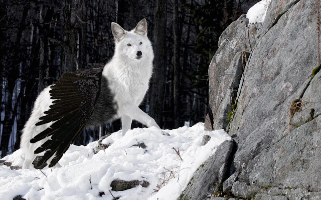
The strongest part about my finished art piece is the wings and black fur, I wanted it to feel like that a pure wolf is being corrupted and that I succeeded by doing that. To show to the person that is viewing my art piece to understand what's going in the photo. The part about my finished piece that I should improve on is the wings because it seems a bit out of place and I want it to look realistic as possible. The tools I used to create my art piece are the Eraser Tool and the Brush Tool. I used the Eraser Tool for erasing parts on a animal piece that I want so i can add it to my hybrid animal. I used to the brush tool so then once I erased a part of the other animal that i'm using the brush tool that it can blend in with the animal i'm creating so it looks real. What was easy about this art piece is blending in the animals to make your hybrid animal, it was much easier to do because we already have done these types of steps for the clone project. So it made this ...



Classmate Critique: Larissa Andrade by Eliane Pontes
ReplyDeleteLarissa photography design or kaleidoscope is very outstanding! The simple composition of her art stands out with the color and the form type. The colors she used makes her out pop out. The circle shapes in the art stands out to the eye. Her three strong areas are her compositions, color form and symmetry. The inverted symmetry she used stands out the art. I know that because the other side is the exact same as the other side for the first image. Her contrast with colors is also another great part of her art. Her second picture is very unique and colorful. She used different effects that were very appealing. She must of used hue/saturation for the color effects and duplicated the images and changed the colors every the she merged the two images and copied it.
She can though, improve trying different symmetry and used better colors. Her circles could be better shaped. She could’ve filled her picture with other shapes all around her art. Try making the colors look more vivid with the image. Make sure it’s lined correctly. Improve it by using the ruler to get the image in the right center.
Effort: 4
ReplyDeleteComposition/Symmetry: 3 (some area's are not aligned correctly and are off kilter)
Submission of All work: 4
Craftsmanship: 3.5 (some gaps in 2nd image)
Artist Reflection: 0 (missing)
14.5/20= 80%